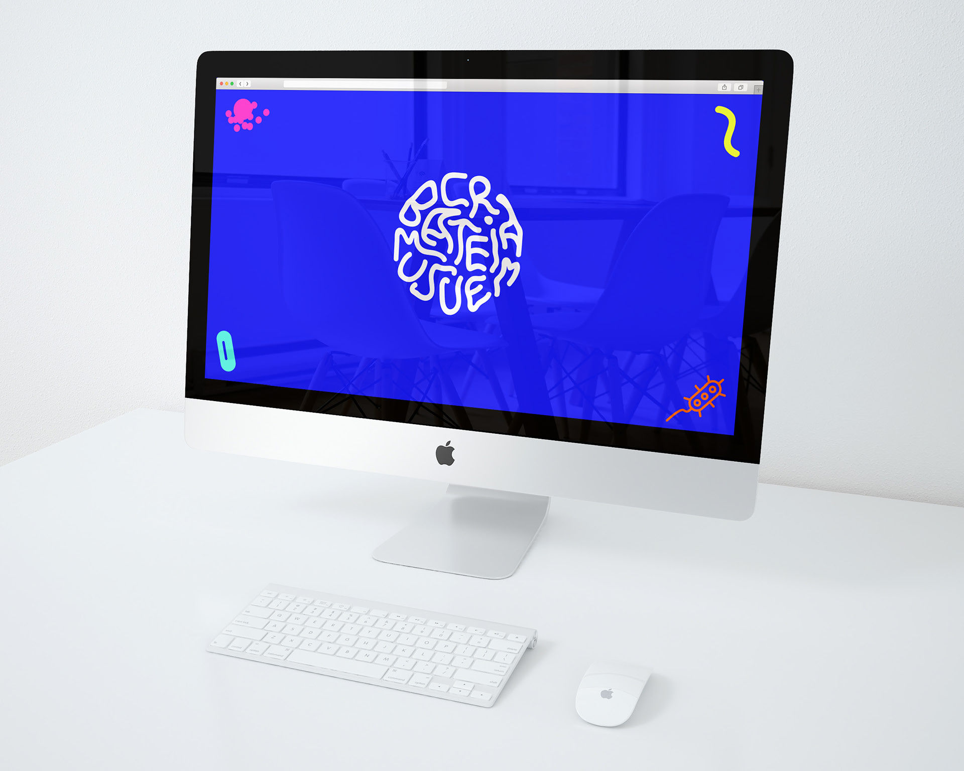
A visual identity design for an imaginary bacteria museum. The use of playful colors are to convey that bacteria are not necessarily all bad but there are good bacteria as well. The museum is also children-friendly so that they can come and explore and have fun at the same time.
The logo was created in an organic form with handwritten letters, relating to the ever changing forms of bacteria. My inspiration came from the 4 most common bacteria in our living houses. The circular forms are to depict bacteria being seen through a magnifying glass. The use of neon bright colors and the organic feeling of the whole visual identity worked well together to catch people's eyes.

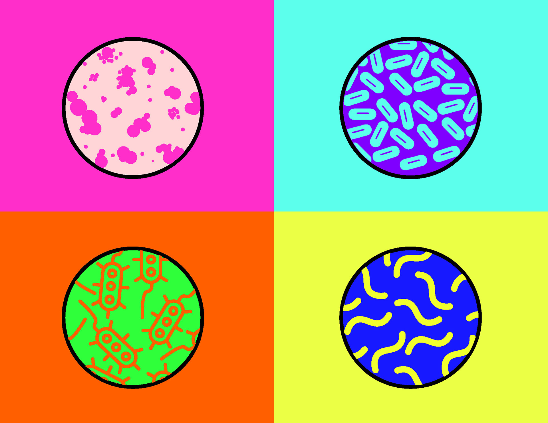
4 most common bacteria in our living houses.